

Industry: Sports and Recreation
Location: USA
Timeline: 2019 – 2021
Building a multi-faceted digital platform to power Areena’s amateur recreational sports
CHALLENGES
In the process they wanted to rebrand, streamline processes, and improve the experience for existing and new users, referees, and their operations.
OUR ROLE

Standing at the cusp of expansion, Areena realized that its low-code software could hinder business growth as they scaled their amateur sport leagues.
Ignite brought a forward looking yet pragmatic mindset to become partners for Areena. Areena got technology strategists, superb user experience designers, and a multi-disciplinary product development team under one roof.
SCOPE OF WORK

USER APP
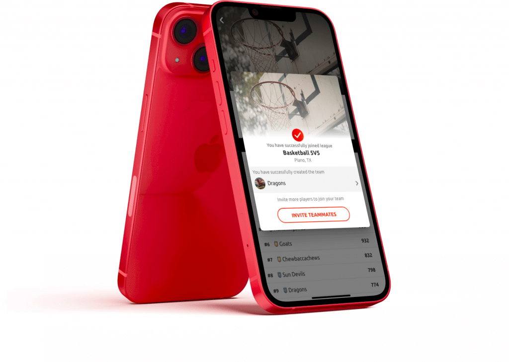
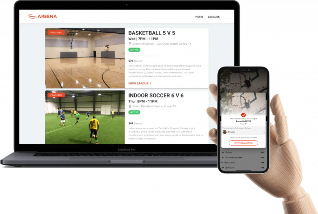
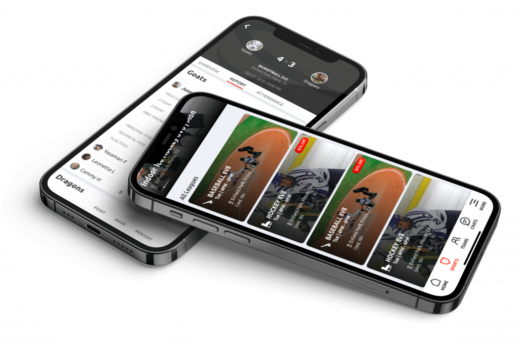
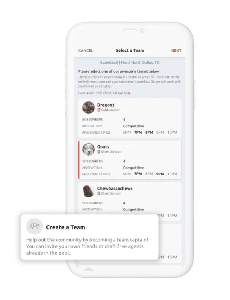
Helps the players manage their leagues, teams and matches along with tracking and sharing their stats. Assists new players to find teams that they will like.
WEBSITE
USER EXPERIENCE
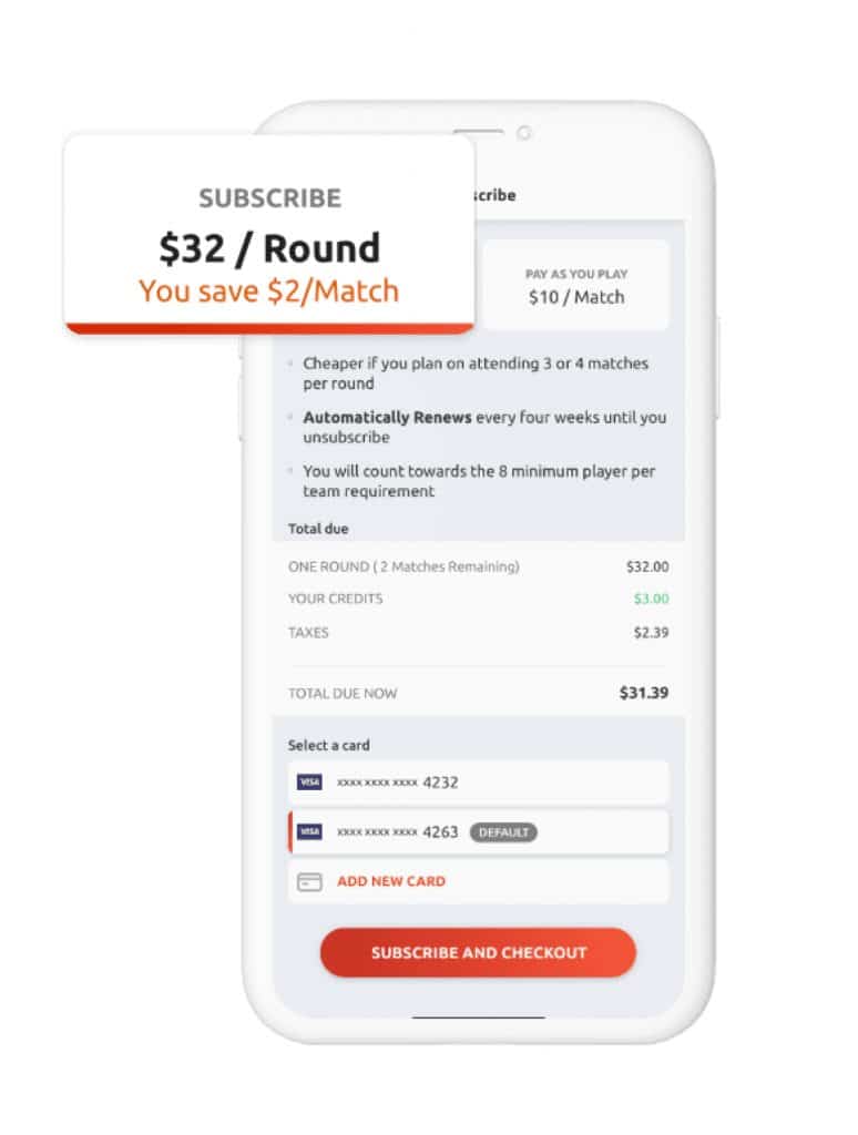
Areena promises a pro experience and fun at the same time. The experience redesign added stats and leaderboards for users to engage with the app long after the match and a fun survey (which the business takes seriously). Future plans include video clips and shareable moments.
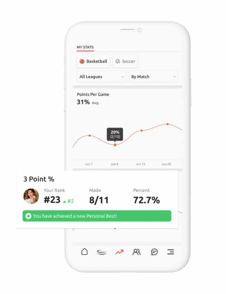
Work around specific pain points
Absentee players result in cancelled matches. People don’t want to show up to the field to have their match cancelled. So, getting positive confirmation of attendance in advance was critical. We tackled this front and center.
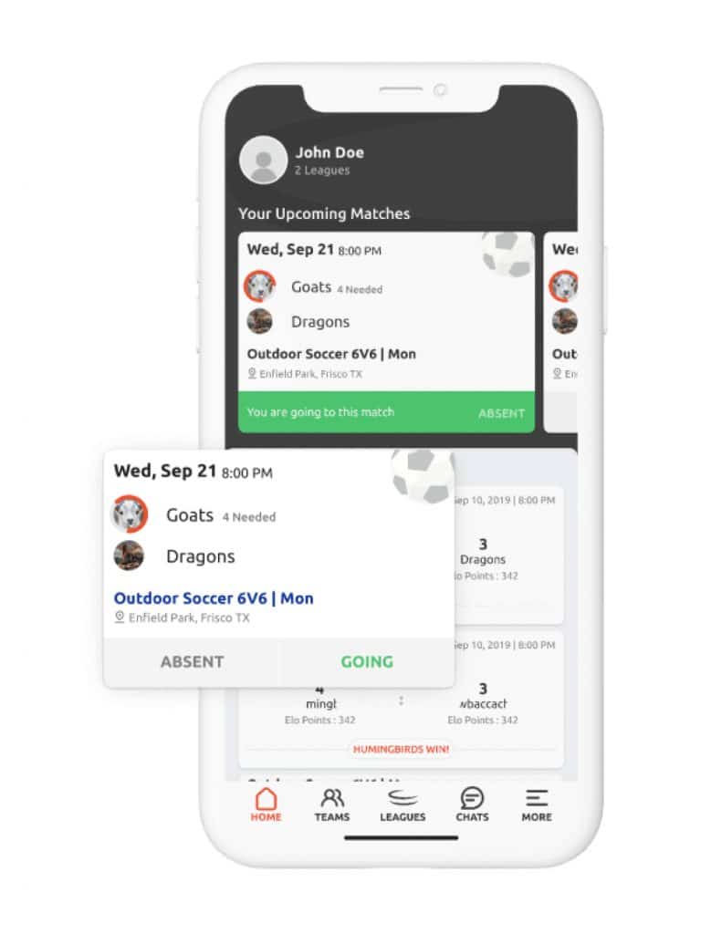
Get Free Agents to find teams they like quickly and efficiently
Free agents are players who don’t have teams. The free agent’s ability to find suitable teams is directly proportional to Areena’s growth. By including a list of teams that accept Free Agents as a part of the sign up flow, it became incredibly easy for players to join teams that fit them, allowing them to quickly get on the field and start playing.
REBRANDING
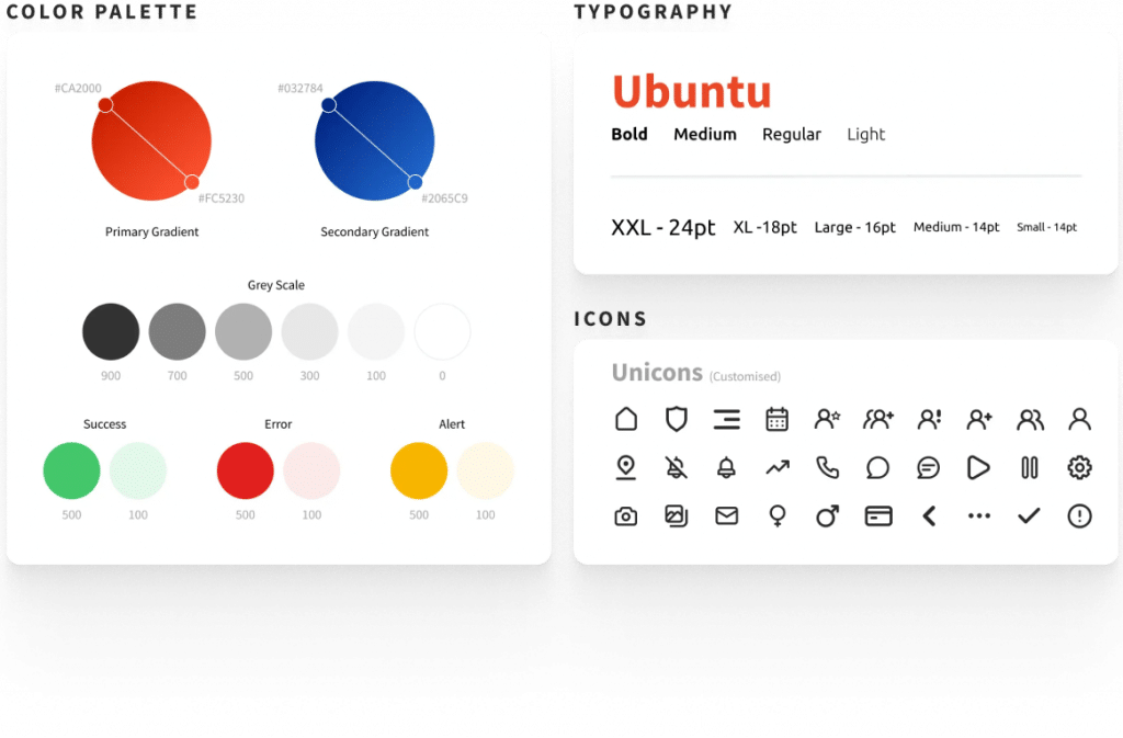
Soon after the project started, the company rebranded itself from HeroLeague to Areena. We worked with the client to understand the values and messages the new brand wanted to convey and came up with the new brand identity and style guide (everything other than the logo).
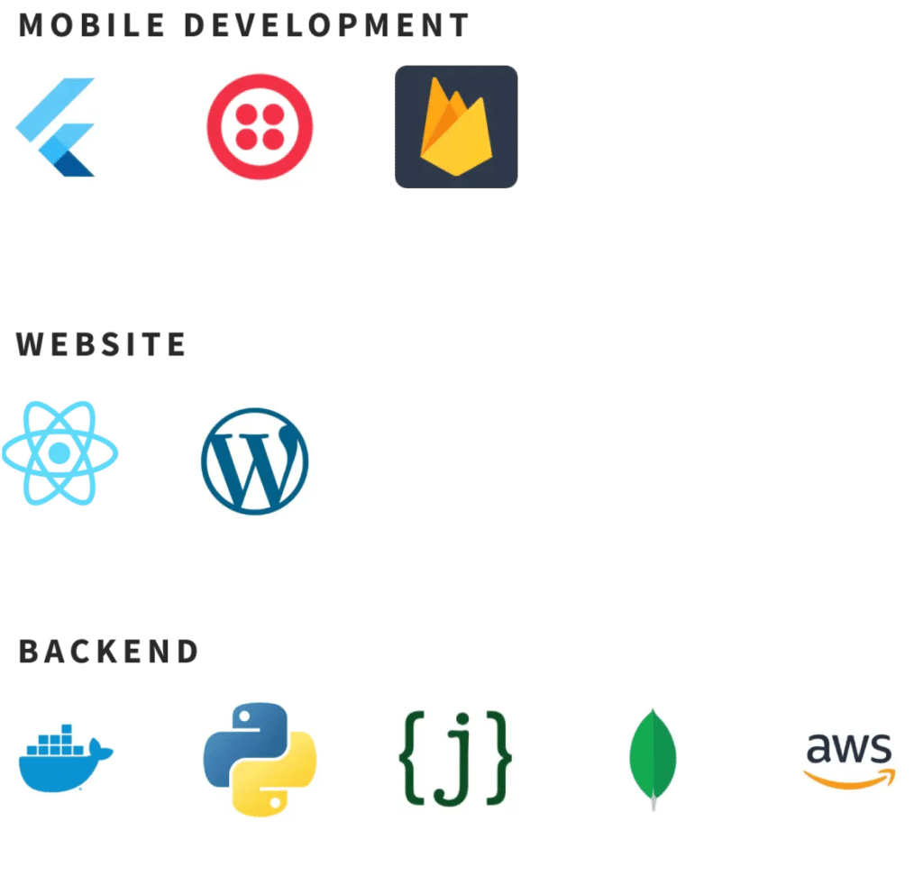
TECHNOLOGY
ONGOING
The system continues to evolve. We’ve added functionality streamlined processes, improved data analytics and continue to keep the platform humming.
Making it Come Together
SOME OF OUR OTHER PROJECTS
CUDDLY
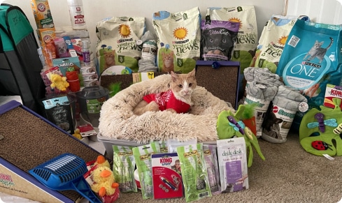
We helped CUDDLY transform from a small fundraising site to a powerhouse that merged eCommerce-based gifting with crowdfunding for animals in need.

Let’s work together to build your game-changing digital products
Want to build cool things?
Let’s work together to build your game-changing digital products
Want to build cool things?
© 2024 – Ignite Solutions India Private Limited