We had three key objectives for our user experience (UX): the daily-use tool had to be simple, fast, and delightful. And we achieved this with a mix of empathy and design thinking.
As a company that routinely practices our design thinking methodology and believes in creating delightful UX designs for products, (see some examples in our work for a device based authenticator, a contact-less vending machine provider) I can say, with good authority, that our own time-tracking app is hassle-free and a delight to use. But it took more than a little work to get there.
Our Requirement
Time logging is hardly a new concept for most companies, and it wasn’t for ours either. It’s a business-critical function that needs to be timely and accurate. Our project teams are multidisciplinary, with each team member often working on multiple projects in tandem. Reporting how much time they spend on each project is an important task, helping project leaders keep their teams efficient and maintain budgets. All of this is possible only when employees log their actual hours, at the end of each workday.
Our time entry solutions have improved steadily over the years. As a result, our previous solution was reasonably good and met many of the business needs such as:
- It allowed people to efficiently add time to one or more projects per day.
- It provided a means to map the time worked to individual tasks in JIRA
- Users could view the time totals for a daily basis across the month.
- It allowed pre-planned leaves to be entered and managed

Our previous solution was lacking in a few key areas:
- A key complaint from our operations managers was that time entry was not timely. Some of our staff got busy or lazy and tended to report in bulk every three or so days. This had implications for our day-to-day management.
- The solution worked only from a desktop browser
- The solution didn’t have the capability to remind users about their missing entries.
To mitigate some of these issues, we had built a reminder system called TimeCop that would remind employees of missing time via a slack bot (more about this in another post). Despite this, we were still finding some level of delay in obtaining the information.
Our Charter For A Better User Experience
To address some of these issues, we decided to improve our time tracking system. Our charter was to holistically improve the time-entry user experience (UX) to meet these objectives:
- More consistency and timeliness of daily entries
- Removing barriers to ensure the process doesn’t feel like a huge burden to employees.
- Remind users to update missing entries with a direct call to action
- Build on initial capabilities to improve the experience by integrating calendar and predictive AI capabilities.
Our primary goal was to make the experience so painless that people actually log their times daily, maybe even multiple times a day.
We don’t often get to design products for ourselves, so our UX design and the technical teams were enthusiastic to build it. Step for step, here are the considerations we made when building the app.
Understanding the user needs
In a typical design-thinking manner, we needed to balance what the business wanted with an empathy-based approach. What were the barriers for employees and were they real or imagined? We wanted to address them through clever use of technology.
First, the business needs
We had a series of interviews and brainstorming sessions with the product owner. We understood the criticality of the tool to making informed business decisions and the pain points. The product owner had put in quite some thought into this, including ideas and near terms as well as longer-term capabilities that they wanted. Overarchingly, the product owner wanted to provide accuracy, convenience, ease of use, rapid entries, and delight.
Next, we understood real users’ usage patterns
Analyzing data
Through interviews and observations, we outlined the patterns of how the previously existing tool was being used. A percentage of users:
- Updated time multiple times a day.
- Waited till the end of the day.
- Many updated time only on being reminded.
- Users liked to be informed about gaps in their time entries so they could easily address those.
Gaining first-hand knowledge
The UX team used the previously existing tool extensively to obtain first-hand impressions and knowledge.
Conducting an employee survey
With all employees working from home, user observations could not be made. So, we decided to run a company-wide survey to get an idea of the barriers, benefits, and reasons for user behavior.
Notable findings from the survey:
- 50% of users record their time at the end of the workday.
- Two out of three use the tool to check for company holidays.
- A third of all users go back to history to check the time they spent on previous projects.
- 77% of users take more than a minute to log time (contrary to our original assumption that the system supported sub-minute entries)
- 36% of users log time after they have wrapped up their work for the day, i.e. in after work hours.
- 75% of people are familiar with and prefer the interface of Google Calendar.
Our UX Design Approach and Process
Based on the product owner’s inputs and user-centric analysis, a clearer picture of what we needed to create began to emerge:
- A mobile app that enables people to update time from anywhere, anytime, even during their downtime.
- Fast operation so users can be in-and-out in seconds.
- Reminders with a call to action and targeted ways to accomplish the actions.
- Drawing the user’s attention on missing or incomplete time entries.
- Allowing people to plan and report future leaves (again, critical for business resource planning) as well as seeing their own historical data.
In short, we needed a holistic UX design for the app.
UX Design principles
To ensure that we would incorporate all our findings into our UX design, we laid down a set of principles:
- Design a smart and futuristic platform that enables clear visibility of projects and time.
- Create a seamless experience to log time.
- Automate repetitive tasks.
- Innovate new interactions to reduce steps and clicks.
- Support the use of gestures and swipes to minimize the clutter.
User and Industry Research
We studied the design and efficacy of other time-entry tools and calendar apps including Google’s and Apple’s, and contemporary UX design patterns. We found that existing time-entry patterns fall in one of two approaches:
- Select the project from a list then select the date and the time spent.
- Select the date from a calendar and then select the project and time logged.
Our needs aligned better with the second approach to managing time for days first. We have multi-disciplinary teams with a section of people who work on multiple projects.
Initial UI Sketches
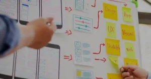
Armed with this information and a concept in our minds, we sketched an initial UX design on paper. Our first concept was a free-scrolling interface, with a callout of your current status on the initial screen and a call to action for the day that requires your time entry.

We converted these to early-stage high fidelity UX designs.

UX Design iterations
With the early designs, we conducted some usability and feedback sessions with the product owner and a few users. We brought in our technical team to understand the feasibility and complexity of some of the ideas. We also engaged other designers from our UX team to provide their input. The designs evolved through multiple rapid iterations.
Final UX Designs

UX design decisions made along the way
We made some inclusions for the benefit of users as we went:
- A dark mode design for users entering time at the end of the day or after-hours, making the app easier on the eyes for nighttime usage.
- A high-contrast call to action button to draw attention to the task at hand.
- Use of color to easily differentiate between projects at a glance.
- Custom design and interaction systems were developed.
- Reduced visual noise (through the subtle use of fonts and text colors). This way, only the pertinent information is immediately visible, though a lot more info is visible with slightly more focused attention.
- Only company holidays (and the user’s personal planned leaves) are visible for future dates.
Innovations and Optimizations
There were a few components and design elements that we iterated through until we got an optimal design.
Duration picker
A component that is used almost every time is the duration picker that indicates how much time the user spent on a specific task. Our original concept was a dial. In the actual design, we initially went with a jog dial.
When reviewing early implementations, we weren’t too thrilled about the UI flow of this component. You had to tap to open it and drew attention away from the task at hand. Plus, it took a tap to close it after selecting the duration. Since we were optimizing for time and user convenience, we decided to change this.
The final design for the duration picker is a custom dial. Hours swipe through horizontally and quarter-hours swipe up and down. This dial sits inline on the screen. This is a vast improvement and a nice innovation.


The layout of a day’s project entries
We iterated a few times on the layout of a day and the entries for that day. Our initial design was to put each entry as a card under the day.

We thought this design was suboptimal. Users would not discern that the dates are actionable with taps to make a new entry and there seemed to be some waste of space.
We then considered removing cards altogether. This did not work since the time entries did not obviously look like they belonged to a particular date.

Our final solution was to make the entire day as a single card, addressing the white-space issue, grouping entries together, and ensuring the dates stand out.

Future Iterations
We plan to keep tinkering with the holistic approach to efficient time recording. We already have Slack and JIRA integrations for the system. We’re also toying with the idea of including elements like birthday indicators and simpler leave balance views. We also intend to use machine learning to predict and pre-populate suggestions on what the employee may have worked on. Some fun additions – like specific icons for holidays (a Christmas tree for Christmas, firecrackers for Diwali, and so on) – are also on the cards.
Conclusion
This project gives us an understanding of the thought process and the hard work in introducing even small new innovative features and interactions for any tool.
Ignite Solutions takes UX design seriously. The attention to detail in small UX components and elements go a long way in meeting user needs and business objectives. Our design thinking methodology sits at the center of all our work whether for our clients or for our internal products. You can read about how the UX design is the lynchpin of the product development process and why we think the UX design extends beyond the UI.


