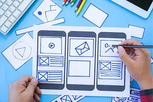
The UX is defined as how a user feels about engaging with your brand, before their first interaction, during all their interactions, and what they take away after their interactions. Do we end up delighting the user, leave them feeling meh or do we let them down? Very often, people use the term UI design interchangeably with the UX design. But in reality, the UX is more than just the UI.
The UX design of webpages, web apps, and mobile apps distil all these aspects explicitly in the design of the UI and the interactions for the user but also implicitly in the messaging and experiences that connect to the user before, during and after a visit or a transaction.
Positive user experience leads to solving the need that the user visited your web/mobile app, increases your brand perception and value in the user’s mind, encourages users to share their success with your brand, and all-in-all drives business success.
Here are the components that our UX designers routinely think through for any project. Some of them might be obvious but others may surprise you.
First Impressions
How does your UX strike people the first time they interact with you (and sometimes even before they interact with you).
- Your Website This one is so obvious that I don’t talk much more about it.
- App Store Descriptions The challenge here is: Can you convey the absolute key reason your app should be downloaded in six screens or less”? Our UX designers work closely with the product owners to fine-tune the screenshots (or pseudo screenshots with key messaging) that appear in the App Store (or Play Store) descriptions.
- Onboarding For apps, this is a crucial component. Do you need a quick, clever way to describe your app to someone who has just downloaded it? Don’t expect the person to know what your app does just because they downloaded it.
- The OG Tags What your users see when your app or webpage gets shared or when it appears in Google searches. This, often, is the first impression potential new users will get about your app or service. Make sure this is designed well and it leads people to the right point of engagement in your website.
The UX of the App
This is what is meant when people think of the UI/UX of the app or web app. Here’s how we look at these parts:
- The style guide: In addition to the obvious items such as logos, colors, and fonts, the style guide covers elements that consistently appear on the site such as
- How to represent information hierarchies?
- How much content is optimal for certain descriptions?
- When to use certain callouts or alerts?
- Types of calls-to-action and their representations.
- The UI design: Of course! This one is obvious. Our UI design specifies the complete layout (for various mobile and desktop form factors). All interactions and any animations associated with these are provided in detail. Reusable design elements are identified to aid consistency of expectations. These are all provided as high-fidelity designs with the visual design elements completely specified along with the layout and the behaviors.
The UI specs are augmented with specific additional functional specifications important for the UI. For instance, the validations for the fields or access control to certain sections of the app/site.
In short, the UI design provides a detailed set of specifications for developers to produce pixel-perfect UIs (leaving nothing to interpretation).
- Error messaging: Let’s face it. Most users will make some error or the other. Oftentimes, it may be UI field level validations (they didn’t enter a valid email address). Sometimes it may be a more complex issue (they are attempting to perform an invalid action). Or, it’s just that the server is unable to process the message. A good UX provides the user with a distinct visual explanation of what is wrong, why it’s wrong and conveys in the next action they should take. Our UX designers not only design the error experience but also validate this in the developed site/app.
Other Touchpoints
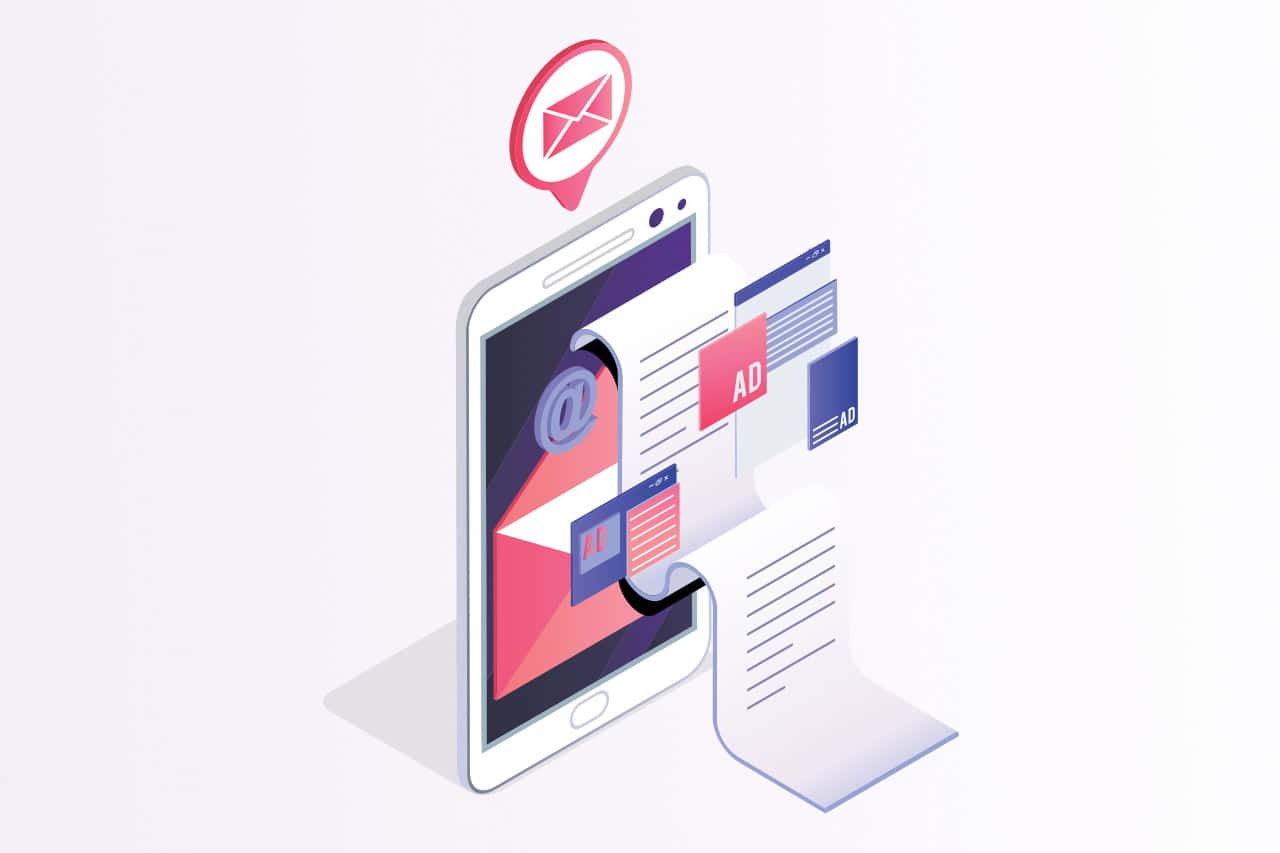
- Email templates and content: Your app or web app will likely be sending emails to your users. Typical emails are email address confirmation emails, welcome emails, transaction confirmation emails, and, possibly promotions, monthly summaries or similar. This is an important touchpoint to your users and part of the pull to bring user’s back to the app. The design of email templates is considered part of the overall UX design and we routinely include this in our design outputs. Equally important: what happens when a user clicks on any call to action. It should be clean, bring the user to the right context and, ideally, pre-fill any information required to complete the action.
- Notifications: In-app, as well as push notifications, should be pity and caring about the user’s attention as a precious resource. The UX role here is to not overdo these. Notify only when necessary and bring the user to the right point in the app.
- Feedback mechanisms: In-app feedback mechanisms are important to obtain real, tangible input from your users. A lot of 3rd party services provide this feature. Integrate these well into the overall UX of your app.
Talk to us if you would like a comprehensive delightful UX design for your product.